top of page

This client requested a set of digital ads to promote their spin cycle classes.
Working off their logo, I chose colors and shapes that would be cohesive with brand identity. I felt that the smooth, swooping shapes also helped give this ad a "cycle" feel.
I also wanted something to fit well with the "Rock. Ride. Love." logo that was supplied so I went with a dark background for that Rock and roll aesthetic.
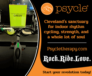
There was a bit more information to include than best practice for a digital banner ad so opting to make this an animated gif instead was the best choice.
I am very pleased with how this turned out. The look and feel of this ad really gives off that "Rock. Ride. Love." vibe.

Psycle
bottom of page